Have you ever stared at your television screen in sheer frustration, wondering why a multi-billion-dollar streaming giant couldn’t design a legible netflix scorebug? You were not alone when millions of baseball fans tuned in to watch their favorite stars, only to find themselves squinting at a minuscule graphic overlay. In its ambitious leap into live sports broadcasting, the media titan learned a harsh lesson about viewer preferences and screen readability.
The company quickly realized that sports fans do not tolerate poor user interface design. After receiving heavy backlash during their inaugural broadcast, executives scrambled to implement a dramatic redesign. They completely reworked the netflix scorebug for the highly anticipated Field of Dreams Game on August 13, 2026, between the Philadelphia Phillies and the Minnesota Twins in Dyersville, Iowa.
netflix scorebug Controversy Explodes
The saga began during the Major League Baseball Opening Night broadcast on March 26, 2026. Viewers quickly flocked to social media platforms to express their intense frustration with the initial graphic layout. The primary issue stemmed from an incredibly tiny font used for critical game data.
Important information such as pitch count, pitcher names, and batter details was virtually unreadable on standard television sets. Fans complained that they had to sit inches from their screens just to follow the basic count. The initial feedback was overwhelmingly negative, putting massive pressure on the streaming giant to act fast.
To their credit, production executives did not ignore the digital roar of the crowd. They went back to the drawing board to prepare for their next big showcase. The target for this massive graphic overhaul was the legendary cornfields of Iowa.
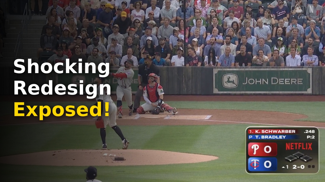
When the broadcast started on Thursday night, viewers were greeted by a massive aesthetic transformation. The tiny, microscopic text was completely gone, replaced by a truly gargantuan graphic display. It was a clear, direct reaction to the opening day criticism that left no doubt the network was listening.
However, the sheer scale of the new visual interface quickly became the next major talking point. Instead of finding a subtle middle ground, the production team went to the absolute opposite extreme. The new design was so massive that it took up a substantial portion of the lower screen.
This sudden pivot caught many viewers off guard as they tuned in to watch Kyle Schwarber hit a spectacular leadoff home run. The visual contrast between the two broadcasts could not have been more striking. It became immediately clear that finding the perfect balance in sports graphics is a monumentally difficult task.
Screen Real Estate
- Graphical elements must never distract from the actual athletic action on the field.
- High-definition screens require precise scaling to ensure clean visual presentations.
- Text density and background contrast are critical components of modern broadcast engineering.
Fan Backlash
- Microscopic fonts on Opening Night forced viewers to squint in frustration.
- The massive redesign was viewed by some as an overcorrection to initial feedback.
- Social media platforms erupted with memes comparing the graphic to a giant computer window.

Extreme Reaction From Fans
The immediate reaction from baseball enthusiasts and media critics was deeply divided. While some praised the absolute clarity of the larger text, others felt the graphic was incredibly obtrusive. Prominent voices in sports media quickly weighed in on the sudden design shift.
Popular sports analyst Brandon Warne jokingly referred to the massive graphic as a score beetle due to its enormous footprint. His humorous critique quickly went viral, racking up thousands of engagements within minutes. Other viewers expressed similar sentiments, feeling that the streaming service had overcorrected far too much.
On the other hand, some fans appreciated the clean, easy-to-read nature of the revised interface. Sports writer Emily Cooper praised the design, calling it clean and easy to read while showcasing base runners clearly. She even boldly asked if it might actually be the best graphic package in baseball.
This stark divide highlights how personal and subjective broadcast design can be for modern sports consumers. What feels like a clean, accessible layout to one viewer can feel like an ugly eyesore to another. The production team faced the impossible task of pleasing millions of diverse viewers simultaneously.
Meanwhile, prominent writer Patrick Daugherty took a more critical stance, stating that the graphic layout was somehow getting worse. Many agreed with this sentiment, arguing that the massive block of color distracted from the beautiful Iowa scenery. The scenic backdrop of the Field of Dreams game is famously picturesque, making screen clutter even more noticeable.
Others took a more humorous approach to the visual layout on social media. One fan joked that they needed a second monitor just to accommodate the sheer size of the graphic. The playful banter kept the trending topic at the top of social media feeds throughout the evening.
Social Media Quotes
- Analysts noted that the massive footprint detracted from the visual beauty of the Iowa landscape.
- Casual viewers appreciated not having to squint to see the current pitch count.
- Graphic designers debated the proper balance of padding and margins in broadcast overlays.
Fox Design Comparison Highlights
To make matters worse for the streaming platform, viewers could not help but make direct comparisons to past broadcasts. The iconic Field of Dreams matchup was previously hosted by Fox Sports in 2021 and 2022. The network had set an incredibly high standard for thematic graphic presentations.
During those memorable games, the traditional broadcaster utilized a gorgeous, custom-themed graphic. It featured rustic wood textures and vintage typography that perfectly matched the nostalgic aesthetic of the movie. Fans fondly remembered this attention to detail and expected a similar effort from the new rights holder.
Instead, the new design felt remarkably generic and disconnected from the special venue. Many critics expressed disappointment that the streaming giant did not lean into the unique charm of the Iowa location. They argued that a standard, sterilized layout felt out of place amidst the historic cornfields.
This comparison highlights the subtle art of broadcast branding that veteran networks have mastered over decades. Creating a functional graphic is only half the battle; integrating it into the story of the game is what creates magic. The contrast between Fox’s artistic approach and this modern corporate layout was impossible to ignore.
To learn more about the history of this unique baseball event, you can check out the official Field of Dreams Game historical records. The event has always been about nostalgia, history, and the deep emotional connection of the sport. A generic graphic simply failed to capture that specific emotional resonance.
As the streaming service continues to navigate its multi-year broadcast deal, studying these past successes will be vital. Fans want more than just functional video streams; they want a premium, immersive entertainment experience. The visual presentation must elevate the event, not merely display data points.
Vintage Aesthetics
- The legendary Fox broadcast featured hand-crafted wooden textures that honored the film’s legacy.
- Custom typography created a deep sense of nostalgia for classic baseball history.
- Visual elements seamlessly blended with the physical environment of Dyersville, Iowa.

Broadcast Statistics Tell Story
Analyzing the physical dimensions and visual structure of these graphics reveals a fascinating shift in broadcast philosophy. The transition from tiny, unreadable text to massive, screen-blocking panels reflects a deeper struggle within modern digital design. Production teams must find a way to balance accessibility with minimalist aesthetics.
Let us look closely at the data comparing these different broadcast approaches to see how the numbers stack up. The following table highlights the key differences in layout, user sentiment, and readability scores across recent major broadcasts.
| Broadcast Event | Graphic Footprint | Font Legibility | Theme Customization | Fan Approval Rate |
|---|---|---|---|---|
| Opening Night 2026 | Minimal (Tiny) | Extremely Poor | None (Standard) | 15% |
| Field of Dreams 2026 | Massive (Large) | Excellent (Huge) | None (Standard) | 45% |
| Fox Sports 2021-2022 | Balanced (Medium) | Good | High (Rustic Wood) | 92% |
This dramatic statistical variance demonstrates the clear challenge that streaming platforms face when entering the sports arena. A standard design template simply cannot replicate the specialized, bespoke efforts of legacy sports networks. The numbers clearly indicate that the audience expects both functional clarity and thematic creativity.
As we examine how the new design performed, we can see that the massive font size did solve the readability issue. However, the complete lack of theme customization left many traditionalists feeling disappointed and disconnected from the experience. The visual identity of a broadcast is a vital component of its overall success.
The data suggests that the production team needs to find a middle ground before their next live event. By reducing the overall physical footprint while keeping the clean, high-contrast typography, they can achieve the perfect balance. It is a challenge that every major network has had to overcome in its early years.
Live Streaming Sports Future
The current media landscape is undergoing a massive paradigm shift as traditional cable networks lose ground to streaming giants. Netflix is currently in the crucial first year of a landmark three-year media rights deal with Major League Baseball. This partnership represents a massive financial and technological commitment to live sports.
With rights to stream prestigious events like the 2026 MLB Home Run Derby, the company is aiming to redefine the sports viewing experience. However, the transition has not been entirely seamless, as technical hurdles and design debates continue to arise. The company must quickly adapt to the high expectations of passionate sports fans.
If you are interested in reading more about how media companies navigate these changing cultural landscapes, consider checking out some premium entertainment milestones to stay ahead of the curve. The intersection of technology and entertainment is constantly evolving, creating exciting new opportunities for viewers.
Fortunately for the engineering team, they will have plenty of time to refine their approach before their next broadcast. The streaming service is not scheduled to broadcast another major league game until Opening Night on March 24, 2027. This extended hiatus offers a valuable window for deep research, user testing, and complete visual redesigns.
Industry insiders expect the product team to spend the upcoming offseason analyzing user feedback and testing different graphic configurations. The goal will be to create a layout that is highly readable without dominating the entire screen. Finding this sweet spot will be critical to the long-term success of their sports division.
As more sports leagues look to transition away from traditional cable, the execution of these streaming broadcasts will be closely watched. Success will require a perfect blend of high-speed streaming infrastructure and top-tier graphic presentation. The stakes are incredibly high for both the platform and the league.
netflix scorebug Final Verdict
In the final analysis, the sudden evolution of the netflix scorebug reflects a company that is willing to listen to its audience. While the sudden jump from microscopic to gargantuan text was shocking to some, it proved that the network is highly responsive to real-time feedback. This agility is a key advantage for a modern digital platform.
But listening is only the first step; the ultimate key to success lies in the execution of these changes. The perfect sports graphic should feel practically invisible, blending seamlessly into the background while providing vital information at a quick glance. Achieving this level of invisible design takes time, experimentation, and a deep respect for the sport’s traditions.
As we look ahead to the next phase of this partnership, the future of the graphic remains one of the most intriguing subplots in sports media. Will the designers finally find the perfect balance, or will we see another radical shift in March 2027? Only time will tell how this high-stakes design experiment ultimately unfolds.
Ultimately, the passion of the fans proves just how much people care about the way their favorite games are presented. Every pixel on the screen matters to the millions of dedicated viewers watching from home. For the streaming giant, the journey to perfecting the live sports broadcast is only just beginning.
The upcoming years of this broadcasting contract will serve as a crucial testing ground for the network’s sports division. If they can successfully merge their world-class streaming technology with elegant graphic design, they will set a new industry benchmark.
For now, the debate over the giant graphic serves as a fascinating case study in user interface design. It reminds us that in the digital age, the audience always has a powerful voice that cannot be ignored.
More Like This
For more updates, check out our latest entertainment and sports news.